
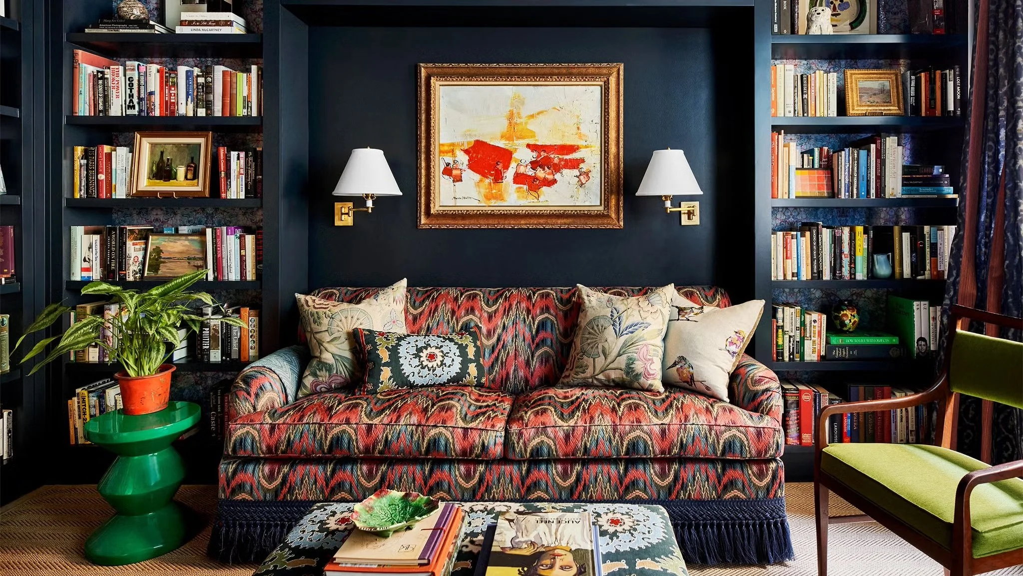
Run one paint color through every door on both floors, reuse leftover finish materials for new builds like a bar top, and give each floor its own color mood instead of matching everything. Designer Rayman Boozer used this approach to merge two identical Harlem apartments into one home, pairing a moody blue floor with a bright green kitchen upstairs.
Rayman Boozer is the founder of Apartment 48 Interiors, based in Williamsburg, Brooklyn. He started Apartment 48 as a home-furnishings store before moving into full interior design and has been designing residential and commercial spaces for close to 30 years. This project combined two identical apartments in a Harlem building — each with its own kitchen, dining area, and living room — into a single home for a client whose parents' townhouse across the street Rayman had also designed years earlier.
The units started as mirror images of each other: two kitchens, two dining areas, two living rooms, stacked on top of one another. Turning them into one home took about two years, partly because combining the units meant relocating the staircase, and any change to a stair has to clear the city's approval for safety and egress.
Rayman's fix for the "two homes" feeling wasn't architectural — it was color. Every door in the apartment, on both floors, is painted the same blue.
"All the doors in the actual apartment are all painted Blue Danube, which creates the cohesion through the two floors."
Downstairs, he also removed the wall dividing the old living room, dining room, and kitchen to create one continuous room, and extended the windows so they read as one uninterrupted run of glass rather than three separate openings from three former rooms.
The ground floor's standout feature is a bar built where the original kitchen used to be, and Rayman describes the build as deliberately economical. The primary bathroom upstairs uses Calcutta Viola marble, and rather than order a second slab for the bar and the new living room fireplace surround, he had the bathroom fabricator cut extra and used the leftover material for both. The seating next to the bar uses the same logic in a different material — Rayman knew he'd be demolishing the old kitchen, so before the layout was finalized he found a sofa sized to fit a specific footprint, then built a wall around it so the piece reads as a custom banquette rather than furniture.
"I think we saved a lot of money by doing this, but at the same time it's really clever, because this is like a cozy nook where the family sits and reads, but at the same time there's a bar right next to it."
The kitchen upstairs is painted Cat's Eye by Benjamin Moore, a saturated green Rayman's client pushed him toward making even brighter than his first instinct. Because the room is small, the cabinetry is fully custom to make use of every inch, and the range is a Bluestar in a custom blue finish. The client set one hard rule before the design started: no recessed lighting. In its place, Rayman used a Visual Comfort sconce in a star shape, repeated four times along the wall.
"When the client came to us, the first thing she said is she didn't want any recessed lights. She wanted to use the star sconces from Visual Comfort. She actually brought it to me and said, 'We have to use the star sconce.'"
The wallpaper behind the cabinetry is a plate-print pattern from Matthew Williamson for Osborne & Little, chosen because it echoes the client's own china collection and reads as three-dimensional despite being flat. The fireplace surround is tiled in Moroccan zellige from Mosaic House, a nod to Marrakech, where both Rayman and his client have traveled and share a fondness for Moroccan tilework.
In the library, Rayman wrapped the room in bookcases and painted it Hello Blue by Benjamin Moore, then layered pillows in fabrics that intentionally don't match. His rule: pair a busy pattern with a quieter one in the same color family, then add one souvenir-style piece — in this case a Suzani — plus an animal print. Pairs of pillows are then split up and mixed across the sofa instead of kept as matching sets, so the room reads as collected rather than staged.
"The reason I didn't want things to match in this room is because I feel like this room is all about relaxing and reading books."
The library also holds Rayman's go-to trick for hiding a television: a frame TV with a colored frame — red, in this case — kept dimmed rather than at full brightness.
"The real secret to making this look cool is to have the TV dimmed so it's not as bright. That's why it just doesn't look like a fake frame TV. It looks more like a painting."
For the teenage daughter's room, Rayman avoided novelty prints in favor of something with longevity: Thibaut's Central Park wallpaper, paired with a Sheila Bridges Harlem Toile shade and matching pillows. He matched the wallpaper's yellow tone to a Harlem-print fabric the client already owned from her previous apartment. The bed is an antique passed down from the client's grandparents, previously used in a guest room at their townhouse across the street.