
Pick one anchor color and carry it through several rooms, then let individual pieces — nightstands, a dresser, a pair of cabinets — be intentionally different from each other instead of matching sets. Designer Kati Curtis used this approach on a landmarked Tribeca apartment for art advisor Jessica, tying the whole home together with a single peacock teal they both loved from day one.
Kati Curtis is the founder of Kati Curtis Design. She grew up around building and design — her father built their family home by hand, her mother ran a nursery school she designed herself, and her uncle was an architect. Kati was drawing floor plans by age ten. Her process now starts with a three-hour client interview covering everything from favorite restaurants to favorite flowers, aimed at working personal and often global references into the design.
This apartment is in a landmarked Tribeca building that had already been renovated into a modern shell before Kati and her client took it on. The brief was to warm the space up with color, texture, and hand-forged, artisan-made furniture — and to build it as a backdrop for art, since the client hadn't bought any of the pieces now in the apartment when the renovation started. Her collection grew alongside the design.
"I feel like most designers, when designing for clients who are art collectors, tend to do very white, neutral spaces. A color, or even darker-hued, background is going to make the art pop off the walls."
The apartment's signature teal came from an early, high-stakes moment in the project. The client called Kati, upset that an early design pass wasn't bold enough.
"She called me crying and she asked me to come up, and she said, 'This, it's not enough. I need this to be pumped up. I need it to have more.' And I took out the paint fan and I just pointed at this beautiful teal, like peacock color, and I said, 'This is the living room.'"
Kati describes that moment as permission — as a young designer, to push further. She carried the same teal into the primary bedroom much later in the project, this time through an ombre wallpaper from Calico Wallpaper. Rather than repeating the color as a matching accent everywhere, she let it anchor two very different rooms in two very different forms.
The through-line of this apartment is that almost nothing is a matched set. In one of the boys' rooms, the two nightstands are deliberately different from each other — one blue, one not — and neither matches the dresser.
"You'll notice that the nightstands don't match. We do have one blue nightstand, but the other nightstand is different. So don't feel like you have to match the dresser and the nightstands. Everything can be different."
The living room runs on the same logic at a larger scale. A pair of heavy, solid-steel cabinets by artist Luke Proctor — collectible pieces in their own right, with a hidden bar built into one of them — sit against a vintage Moroccan rug whose soft pattern and color offset the cabinets' hard edges. In the primary suite, a large-scale floral curtain fabric and dark, patterned wallpaper are deliberately paired with leather-fronted nightstands, bronze hardware, and angular Holly Hunt sconces, so the room doesn't tip into feeling purely feminine.
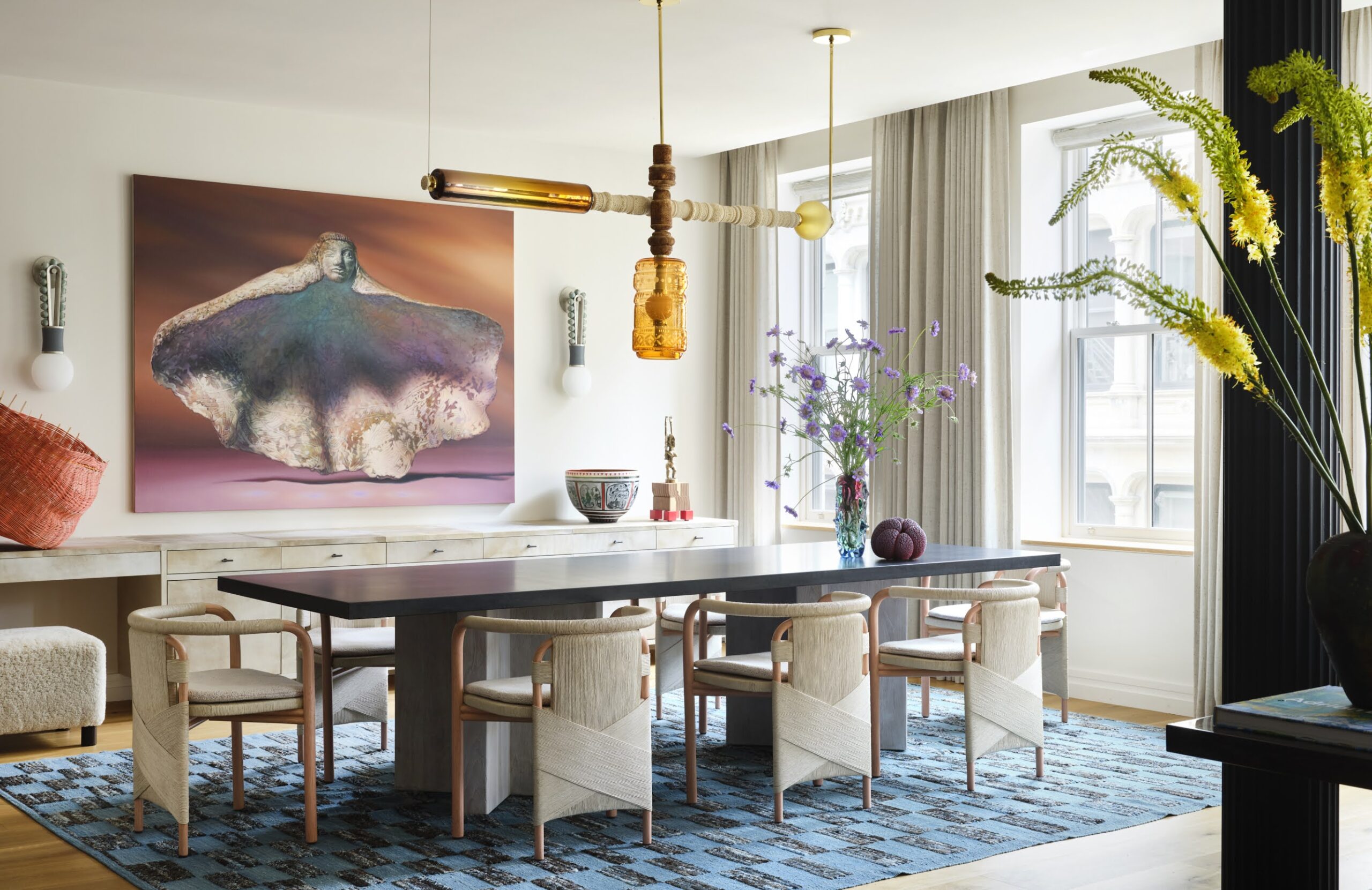
The dining room has a ten-foot table, a wall of windows, and mostly hard surfaces — concrete, glass, tile — which risked reading as cold and harsh. The fix was texture rather than furniture: alpaca curtains in a raw fabric added softness to the room without requiring a redesign of the hard finishes. The dining room's other anchor is a chandelier from Wexler Gallery, made by a Turkish glass artist and finished with hand-carved meerschaum pipe pieces. A pink Murano glass element at the base complements the piece rather than matching it outright.
The kitchen came to Kati all white: white marble counters, white plastic cabinets. Both went. She replaced the cabinets with walnut veneer and the marble with a creamy quartzite — the only stone she says she'll use in a kitchen, because it performs like a synthetic surface while still being natural stone. The hardware is from Rocky Mountain Hardware, one of the few remaining metal foundries still operating in the US, using largely recycled materials.
"White marble is not practical for any kitchen. Quartzite is natural stone, but performs like a synthetic. You can set hot pots down, no problem."
Kati's rule for kids' spaces is to choose finishes the child can grow into rather than out of. Both boys' rooms share a durable, patterned wallpaper from Philip Jeffries, and the art on the walls is treated with the same seriousness as the art in the living room. The boys share a bathroom finished in a circular glass tile that reads as playful without being overly juvenile — a choice Kati expects to hold up as the boys get older.
"New York City apartments, pedestal sinks, dumb idea. Add the storage."