
Keep the structurally sound parts of a dated house — walls, floor plans, even a favorite dome ceiling or curved staircase — and strip back only what makes it read as a specific, dated style, like heavy travertine surrounds or oversized columns. Designer Britany Simon used this approach to turn a heavily ornamented 1990s Tuscan-style house in Scottsdale into something modern, colorful, and entirely personal — without a full gut renovation.
Britany Simon is the owner and principal designer of Britany Simon Design House, based in Scottsdale, Arizona. The clients on this project are the parents of a former intern of Britany's, now an employee at the firm, so there was an existing relationship and comfort level going in. They're empty nesters who wanted to make the house entirely their own: they love to entertain, don't care about resale value, and came in with what Britany describes as a "let's go for it" mentality.
"We came in and really touched every surface and de-Tuscanized, if you will, most of the home. You would not believe the before and after and how drastic it is. It's like a new house, but it's not."
Britany's team kept most of the interior walls as they were, then peeled back the layers that made the house distinctly Tuscan — travertine surrounds, oversized ornate columns — to get down to a blank slate. The kitchen is the clearest example of that restraint in action: the appliance placement and the shape of the original island both stayed exactly where they were. The renovation there was almost entirely a materials swap — new cabinetry in a mix of painted and stained wood, with a diamond-patterned upper cabinet door as the one signature detail that sets it apart from a standard flat or shaker front.
Rather than flattening out the house's rounder, more theatrical architectural moments, Britany's team kept them and changed what surrounded them. The entry's existing ceiling detail was elevated rather than replaced. The primary suite's oval vestibule — previously painted with a cloudy sky mural and heavy, Renaissance-style drapery — got a new ceiling pattern, and a pedestal displaying a piece of sculpture was kept as a deliberate pause on the way to the bedroom.
The great room's round dome got the same treatment: kept structurally, repainted with a large-scale mural, and left in place because beyond looking good it actually amplifies conversation.
"It sort of acts as this acoustic element that makes voices louder."
The central rotunda staircase, with its column platform and dome above, stayed almost entirely intact — only the stone top changed once the clashing original color palette was replaced with one the clients were excited about. A rounded ceiling in the formal living room ruled out standard recessed can lighting, which would have cut into the shape. Britany's team landed on oversized Visual Comfort sconces with cracked glass large enough to read as a design feature rather than a fixture — a deliberate callback to the cracked-glass detailing used throughout the original Tuscan design, reworked in a more modern way.
The primary bathroom is where the clients' hands-off-resale mindset shows up most. At the first meeting, they were direct about what they wanted.
"We don't care about resale. We want a bathroom that feels like we walked into a really swanky hotel and like nothing we've seen."
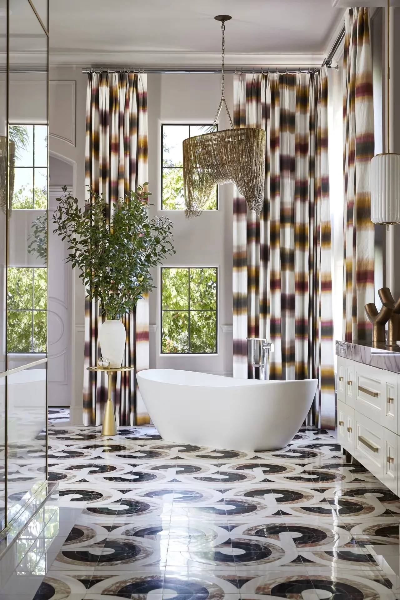
That gave Britany room to build the whole room around a bold tile that set the color palette, lean into a slightly Art Deco lighting direction, and use as much of a striking quartzite as possible — including framing mirrors around it to maximize both height and mirror surface. The shower, previously tucked behind glass block and drywall, was rebuilt with a brass enclosure for a fully different, more open feel. An underused angular corner became a lounge nook by reusing a sofa and shape that already existed in the room.
"I've decided that every bathroom needs a lounge area now, just because of how this bathroom came together."
Several of the home's most distinctive rooms started with a single object rather than a blank brief. The formal dining room was built around the client's existing crackled-glass table, paired with a new base and a set of chairs Britany had been holding onto from a market find, waiting for the right client. The room's hand-painted, softly patterned mural wallpaper came from a mural artist Britany has worked with on multiple projects — the same artist who later free-painted the large-scale pattern on the great room's dome, working from a rough concept the team handed off and then let her run with.
In the formal living room, oversized deep-burgundy chairs and mirror-look coffee tables set a more sophisticated, playful tone, and a curved sofa was chosen deliberately over a long, straight one.
"I love a more round shape for a conversation area. It's so much better for sitting and chatting and having friends over than a straight long sofa, because it sort of encourages you to have a conversation."